An AR online fitting experience designed for lululemon buyers.

My Role
Duration
10 weeks
December 2021
UX research
Product Prototyping
UI design
Tools
Figma,
Adobe Illustrator
Team
Yilin Niu
Yu Cheng
Redesign lululemon App
Online fitting experience
.png)
To solve the pain points of online clothing shopping, this project upgrades lululemon's online fitting efficiency of sizing and styling by integrating AR technology into the lululemon mobile App, which streamlines the experience of fitting lululemon sportswear online.

Background \
Recently rapid rising labor costs, hotly discussed Meta Universe topics, the growth of major brands' online sales, and the Covid -19 epidemic have hinted that online shopping has become an unstoppable trend.
However, online clothing shopping still faces high return rates caused by improper sizing, unimaginable materials, etc.
Lululemon, as a well-known sportswear company with a brand image for tailoring fit, comfortable fabrics, and innovative attitudes, reimagining its online shopping experience is challenging and promising. We kept the original look and feel of Lululemon but only focused on optimizing one specific experience - online fitting.
01
User Research
To understand users' general attitudes towards online clothing fitting. We conducted semi-structured interviews, surveys, and observations with online fashion shoppers.

Semi-structured User Interview \
Activity examined
-
Understanding what fitting features matter when users shop clothing online.
-
Finding out what they like and are dissatisfied with the existing online clothing shopping experience.
Interview Questions

Observation


Filter
Choose size
Zoom in details
When User A searched products, she first filtered by size.
User B User scrolled down to choose the size in different measurement units.
User C always zooms in on pictures to check the details.
Interview Quotes

User need-finding \
-
User needs a way to know if the size of the clothes is suitable for them.
-
User needs a way to match clothes and get feedback quickly and clearly.
-
User needs a way to know the size of each piece of clothing, the height and measurements of the model, and the size of the clothes on the model.
-
User needs a way to let their friends help them select the clothes again after selecting online.
-
User needs a way to experience a more realistic try-on virtual experience.
-
User needs a way to see the details of every product clearly, like material and color.
-
User needs a way to get clothing recommendations based on browsing history, and they want to see them in obvious places.
-
User needs a way to see more reviews and photos from buyers to judge if the product is worth buying.
-
User needs a way to try on clothing before checking.
-
User needs a way to increase the efficiency of fitting.
-
User needs a way to get discount information easily.
-
User needs a way to check recommendation items from influencers quickly.
-
User needs a way to try more different clothing in a concise time.
-
User needs a way to see more photos and descriptions of the clothes.
-
User needs a way to return goods and efficiently.
-
User needs a way to invite friends when trying on the clothes virtually in real-time.
-
User needs a way to store/her body data and don’t need to spend too much time selecting a size.
-
User needs a way to have a clear, smooth, and design-conscious online clothing shopping experience.
Scope down the focus \
We gathered and wrote down feedback and observations on sticky notes. They are quotes from the interviewees and observed user actions or errors. And then, we organized information into 6 clusters.

User research key insights \

1. Taking too many steps to check the size and details of a product.


2. Missing approaches to fitting based on the user's body data.
3. Lacking approaches to match and compare products.
Problem Statement
How can we improve the efficiency and experience of online product selection for Lululemon users?
02
Ideation
Persona \


03
Concepts Validation
Usability Testing \
We used Figma rapid-prototyped the top 3 functionalities and conducted usability testing to validate the design. We set up test objectives, tasks, and rubrics for measuring each usability testing result. The users were asked to think out aloud during each testing process, during which we transcripted down all their mistakes, slips, and confusion from our observations.
The main feedback and design iteration are listed below.
Tested Function #1
If the AR model fitting display helps improve the efficiency of choosing size and color when shopping online?

Testing Tasks
Task 1 - Find AR Portal
Task 2 - Scan the environment
Task 3 - Place AR model
Task 4 - Change Product information
Task 5 - Compare products


Tested Function #2
Whether the body data collection feature helps users build virtual profiles to choose the right size better?

Testing Tasks
Task 1 - Enter the basic information about your body size
Task 2 - Adjusting the body model
Task 3 - Enter your figure details
Tested Function #3
Whether social shopping could help users see the details and the comments efficiently?

Testing Tasks
Task 1 - View details of the product
Task 2 - View comments
Task 3 - Invite your friends
Task 4 - Change the color you choose
Task 5 - Add to your bag
Testing Feedback \


'The live room for sharing fittings is complicated, it actually would reduce the efficiency.’
'There are so many clickable places on the AR model that I can't seem to find the point. '
' seems too much data to input, in fact except for height and weight, I don't know the specific data of my body size.'
'Putting multiple models even makes it harder for me to choose.'
Design Iteration \
Based on the feedback we received from user testing, we iterated on the design. The main improvements for the next stage are listed below:
1. Give up the function of sharing live shopping with friends
2. Simplify interactions with the model
3. Gamification and simplification of body model data input
4. Give up 'multi-product compare,' keep the focus on 'size compare.'

Kept feature
Abundant feature
To be improved
Brainstorming \
To improve the efficiency and experience of online shopping for lululemon users, we conducted brainstorming and listed possible solutions to this problem. Finally, after discussion and voting, the following solutions were selected:
AR Models: Use AR try-on models to display product information
AI Assistant: Recommend products suitable for users’ body size through intelligent algorithms
Social Shopping: Allow users to see the details and features in a more interactive way

Paper prototyping \
Based on the brainstorming results, we created three paper prototypes to better communicate the concepts with the team.
Solution #1
Most likely to work
Recommend products suitable for the user's body size and style according to users’ body data input.
Solution #2
Rational choice
This solution showcases true-to-scale Lululemon products through AR. The user could place virtual models in their room through an iPhone camera.
Solution #3
Most likely to delight
Restore offline shopping experience through AR live room, allowing users to see the details and features in a more interactive way.
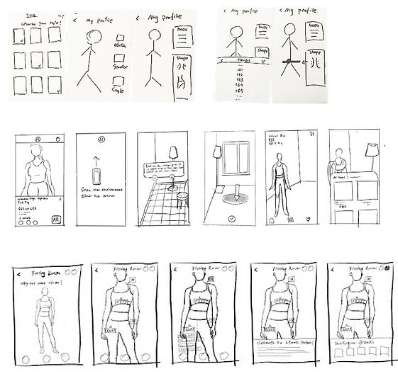
Wireframing \
We aimed to simplify the steps to get the right size, color, design, and details for a lululemon product and enable a more interactive online shopping experience. We drafted the main wireframes based on our design goal.
.png)

04
Final Design
User Flowchart \

UI Styling \
Font

UI Elements & Logo


05
Hi-Fi Mockup
Scan environment:
Scan your surroundings to confirm the plane to place the AR model.
Place AR model:
Place life-size AR product models in your space.
Scan environment
Place AR model
AR Setup


Input body data:
Choose your type of body shape.
Adjust body shape:
Input your height, weight, waistline, etc.
Customize model
Input body data
Adjust body shape


Compare sizes
Compare color
View product information
Compare sizes
Compare colors
Trying different sizes and colors on the custom AR model.
Check product details
You can approach and walk around the AR model to view product details from different distances and angles.


06
Reflection
The final design presentation was generally affirmed by the lululemon team. As the design evolves, we believe it achieves the goals outlined at the beginning of the design process. We considered users' needs and made the product purchase process of the lululemon mobile app more interactive and efficient.
Given more time, we would like to improve the inclusivity of the design. That is expanding the selection of fitting models to more races, skin colors, and body shapes, which continues the inclusive design spirit that lululemon always conveys.
A designer is not the user:
It’s easy to think of yourself as a typical user. However, users have different experiences, terminology, and different ways of looking at the world. Using interviews, surveys, focus groups, contextual inquiry, etc., is a great way to unveil users’ thoughts. It helps designers reveal what people think. Learn what they want and need instead of what I think they want and need.
Validate at any time:
As the project progresses, the cost of modification will become more and more expensive. The earlier the test, the more efficient it is. We should verify the design idea as soon as possible and repeatedly ensure that the design always solves the proposed problem. In this design, I learned another method called Heuristic Evaluation. It is a systemic walkthrough of the interaction design by experts with cheap, quick, and easy features. Put it Combined with usability tests like cognitive walkthroughs helped me look at the design from both professional and user perspectives. I will also explore more user testing methodologies in the future.


